top of page
My Role
Logo designer
Ambra works in hospitality, food & beverage and event planning.
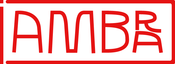
She wanted a minimal logo that could tell her story without being too obvious.
The result is a clean wordmark that can be read in two ways: “AMBRA” and “AMBAR”, a subtle nod to the word “bar”.
Its shapes are inspired by the world of hospitality, from a seat to a wine glass, a cocktail or even a simple glass of water. Clean lettering, essential forms and a simple play on words make the identity distinctive yet understated.
Can you find the missed "I".




bottom of page